First impressions matter. We humans make our snap mental judgments in seconds, whether we’re deciding how we perceive a person, a place, a company - or all three.
So it stands to reason that your office reception, the first space your clients see, needs to be at the top of your list when it comes to designing your perfect workplace.
It’s not just about the warm welcome…
Like the handshake to your HQ, the entrance to your space helps to set the tone for what’s to come. If it bursts with welcoming vibes, you’ll put visitors and staff alike at their ease from the minute they enter.
It’s also the physical face of your company, speaking up before your team have even opened their mouths.
So it’s not just about making your clients feel all warm and fuzzy and relaxed.
You also want them more than a little impressed, marvelling at your enviable design nous, forward-thinking approach and obvious consideration for wellbeing elements.
Your reception space needs to be as smart and stylish as it is inviting. What you want is a warm welcome with extra wow.
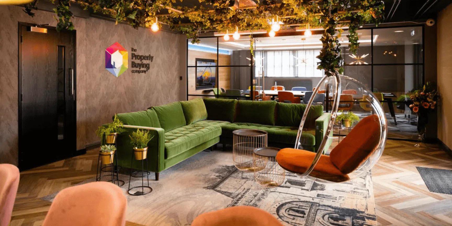
DesignTonic X The Property Buying Company
Enter the Design Tonic team, with our top tips for an office reception that oozes sleek style from every inch.
Make it obvious
First things first - let’s borrow a term from the digital world and say we need to think about the user experience.
The last thing we want is confused visitors so, from the moment they rock up at your office, we want not a shadow of a doubt that they’re in the right place - meaning clear signage, recognisable brand colours and a blindingly obvious flow from the door to the reception desk.
The beautiful reception renovation we recently completed for Formal Investments is a great example of considered flow.
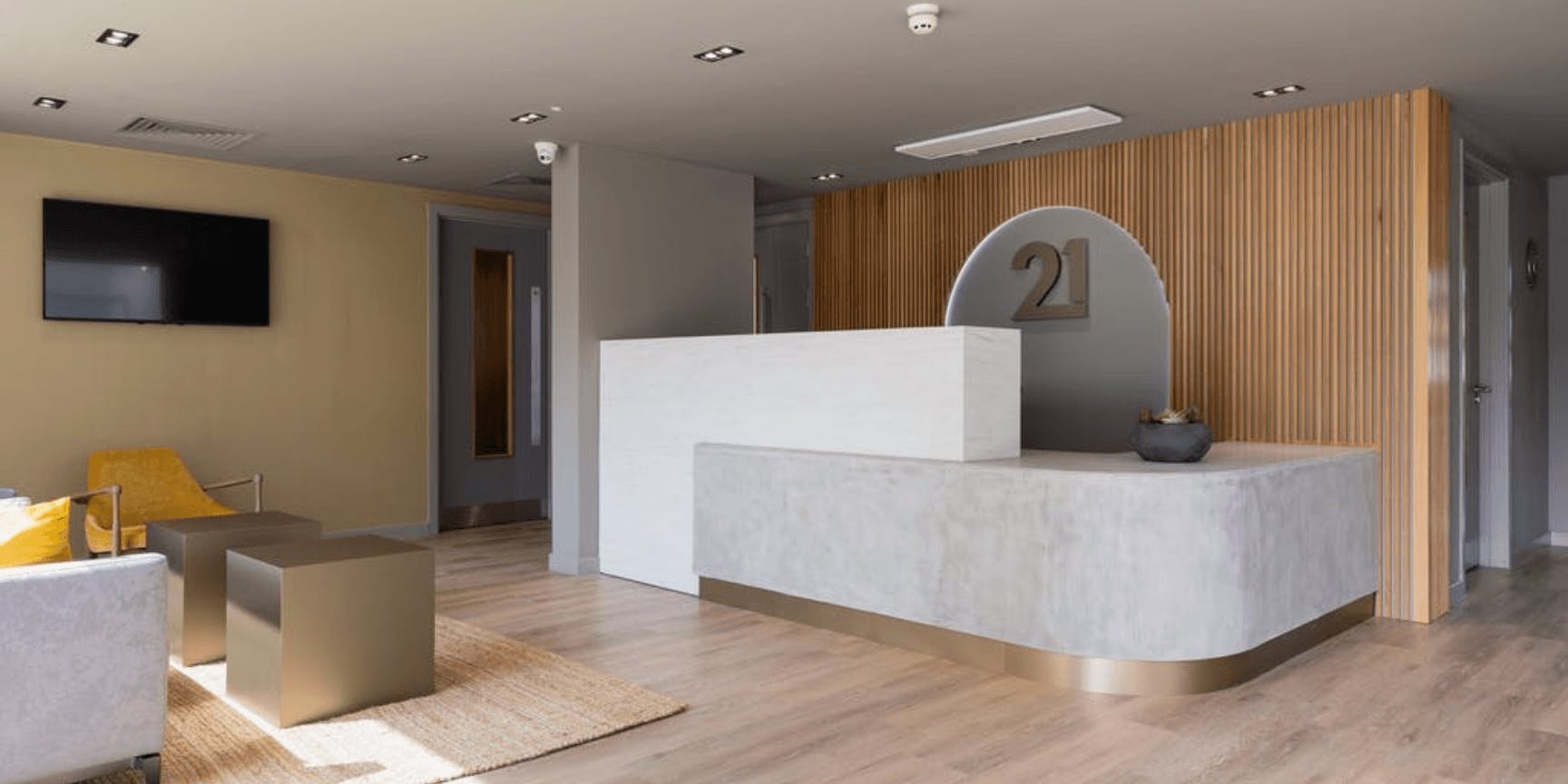
DesignTonic X Formal Investments
With plenty of unencumbered space from the entrance through to the large, centrally sited reception desk and beyond, the direction of movement throughout is plain at a glance.
For extra visual effect, our team played with soft contrast, using tone and texture in materials and finishes to draw the eye, while keeping the whole area feeling light and spacious.
Pretty, practical and packed with personality
More than any other part of your office, we want your reception area free of unnecessary clutter - we’re looking to channel a look of luxurious minimalism.
Every piece should be purposeful, functional and/or aesthetically pleasing with a flashes of your branding and company personality woven throughout - and don’t sacrifice practicality for style, the two need to go hand in hand.
As in any minimalist space, good storage is a must; from handy side rooms to custom-built spaces, storage hidden in or around the reception desk to good-looking magazine racks and storage tables in the seating areas.
Look for materials and finishes that are durable, easy to clean and able to withstand a lot of footfall and wear and tear. It’s worth investing a little more upfront on items that can be repaired with minimal fuss.
Lighting is another important functional feature. Layer it up, beginning by enhancing natural light with additional ambient light and then adding function and ambience with task and accent lighting.
And don’t forget the greenery!
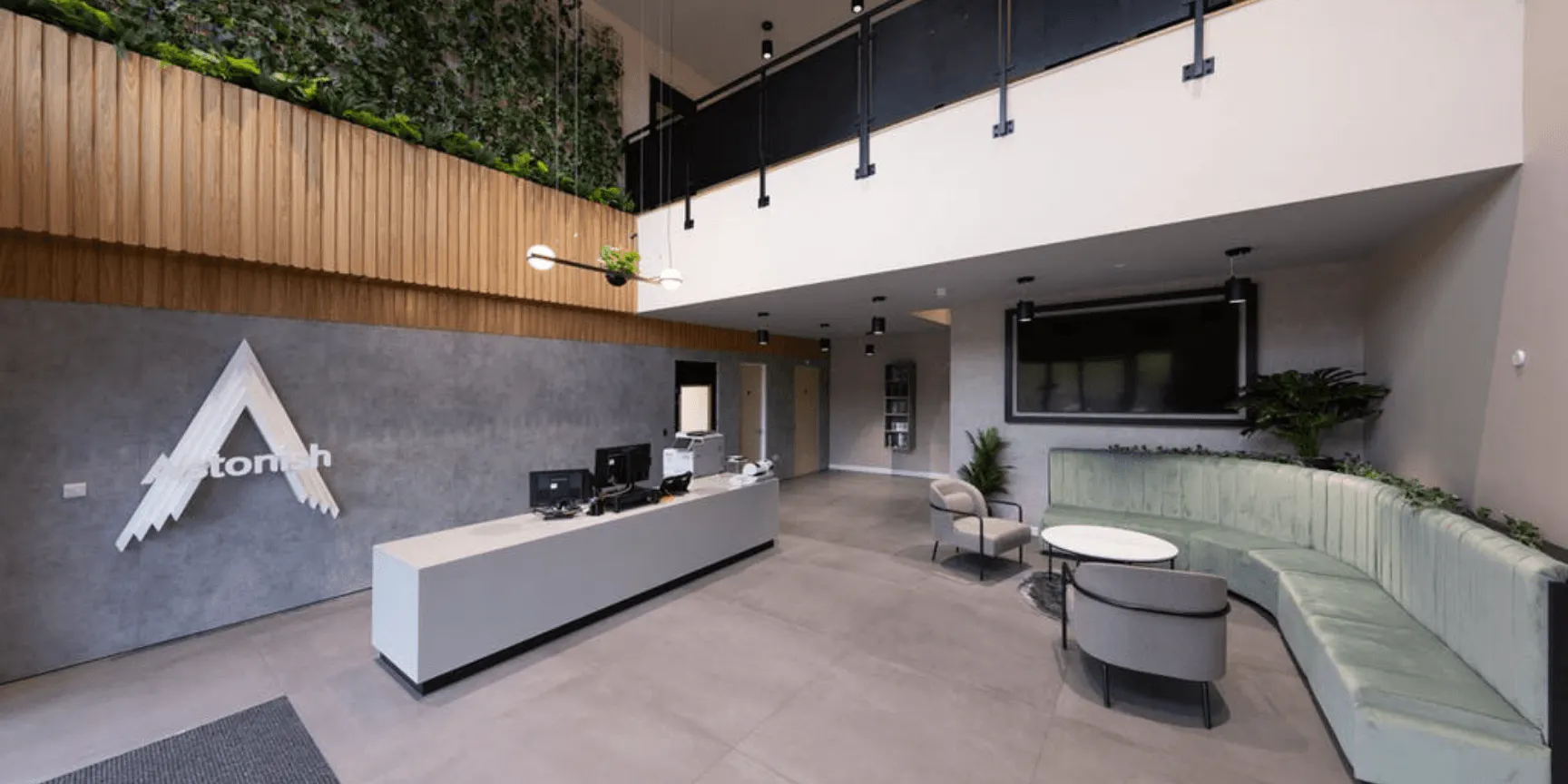
We love it anywhere, but lots of lush planting makes a wonderfully welcoming statement that’s as good for the soul as it is easy on the eye, as in this spectacular, double-height meet and greet area we designed for Astonish.
With a subtle natural theme throughout, the planting is offset by warm woods, earthy neutrals and plush velvets in a mid-Sage green - a lush, sophisticated space that’s a pleasure to spend time in.
“Think outside the Box” Branding
For a truly memorable impression, dare to think different when it comes to branding your office reception.
Big is always better in an entrance space, but why stop there!
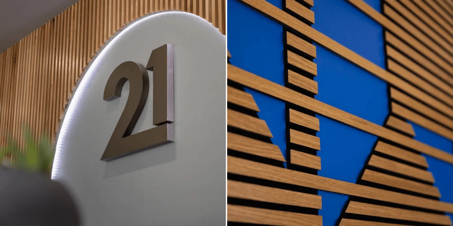
DesignTonic X Formal Investments (left) & Genuit
At Formal Investments, we inset the logo within an eye-catching arch, before adding feature LED lighting all around the edge to make sure it pops, no matter the season.
While at Genuit, we embraced the contrast of their vibrant blue logo against the on-trend oak cladding, capturing the brand perfectly and guaranteeing a lasting impression on visitors.
Neon is another striking way to make your signage stand out from the crowd - but one of our all-time favourite “think outside the box” branding elements is the one that adorns the ceiling here at DesignTonic HQ.
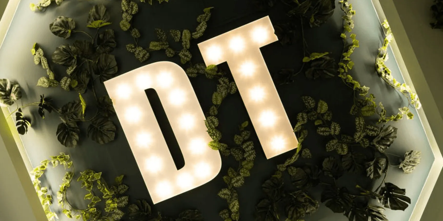
Branding meets biophilia meets bold, bright theatre lettering, it’s a three-in-one solution that ticks all our design boxes!
Sales mode: On
Whatever your company is selling, be it product or service, your reception area is a fantastic place to showcase what you’re all about.
When tackling the makeover of the Masons Gin premises, we made sure to incorporate plenty of beautiful iron and timber shelving alongside their opulent bar area.
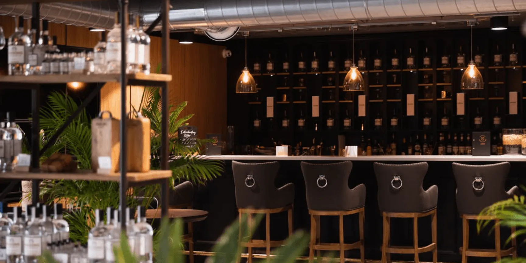
As well as being on-brand and perfectly suited to the fabric of their stunning industrial building, it’s a canny place to show off their wares and entice visitors into a little lingering exploration as they pass by.
Comfort, comfort, comfort
If in doubt, always opt for the most comfortable reception furniture you can.
Today’s easy-care options are a far cry from the scratchy, unforgiving “corporate” fabrics of old, so it is possible to go plush in this high traffic area without regret.
Comfortable sofas, cushioned chairs, plush velvets and luxe linens - all have a place in your meet and greet space, alongside soft rugs to help delineate areas and tactile-yet-strong tables in wood, metallic and marble finishes.
It might look inviting, but low seating isn’t a great choice for your office reception as some people can find it tough to get up and down from. Instead, choose mid-height seats with lots of padding, and preferably armrests to help give a little extra oomph to those that might need it.
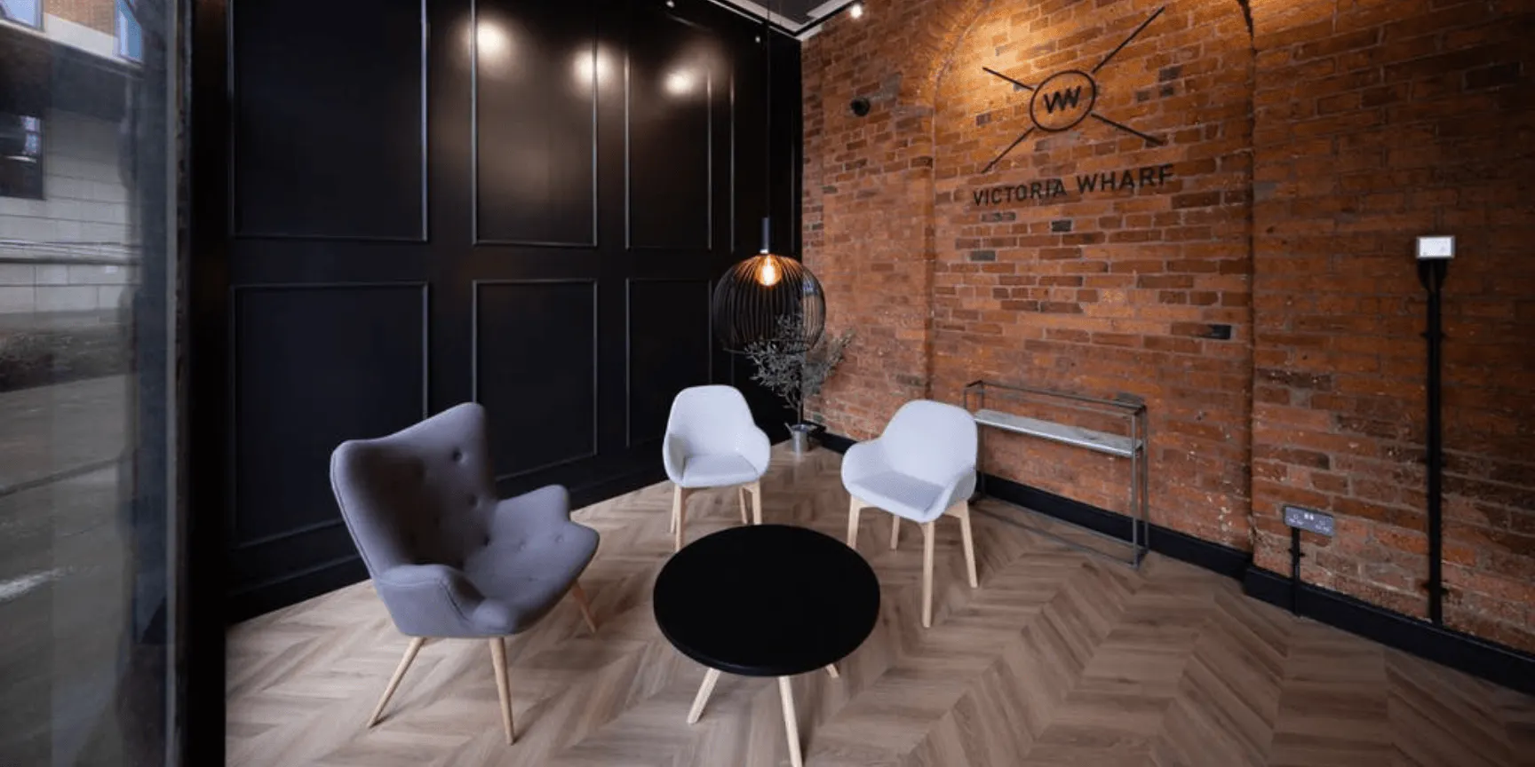
And, if your space and branding allow, it can be wonderfully cosseting to go for a darker colour scheme for drama and interest, like in the beautiful entrance space we designed for Victoria Wharf on the Leeds waterfront.
Here, the building’s traditional wharfside styling and original brickwork is complemented perfectly by rich off-black panelling, while visitors can sink into the gorgeous egg-style armchair and rise with ease.

